We are really big fans of the place. The materials and appliances are well-made, thoughtful, and of high quality. The layout is open, roomy and slightly modern. High ceilings, hardwood floors, and contemporary touches. And the location is fantastic- walking distance to Harvard, walking distance to MIT, walking distance to church, and a short bike ride to the heart of downtown Boston.
The place is a 1 bedroom condo, with a little extra room / office, which is currently serving as our music room.
There is a living room:
Bedroom:

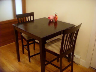
Dining 'room' (more like a nook in the kitchen):
Bathroom, replete with appropriate IKEA designed accoutrements:
I like the sink design well enough, I will show you another picture of it:
One of the most striking things to me, having lived in the condo for
about a month now, is the spectacular number of lights and
light-switches we have. Keep in mind, this is a small 1 bedroom
condo, and yet I counted (at least!) 33 total light bulbs and 23 light switches. And that doesn't even count any lamps or appliances that we brought on our own.
Here is Meg's favorite part of the house. It's the kitchen. The centerpiece of the condo. It's smack dab in the middle, opening out into both the living room and the dining area. Nice granite counters (lots of counter space), furnished with quality appliances, cabinets of a nice bamboo type wood with lots of nifty nooks and crannies and rollers and glass panels and what have you. We both enjoy it.
Here is my favorite element of the house. It's the 'door' to the bedroom, only it's a floor-to-ceiling, solid wood and frosted glass behemoth of a sliding door. How useless-but-super-cool is that!
But I think the main item that really sold us both on this place is the remarkable openness of the living space. For example, in the photo below I am in the living room taking the picture. You can see the living room, breakfast bar, and kitchen in the foreground. In the background you can see through the bathroom into the bedroom, where Meg is sitting on the bed, and at the same time you can see through the aforementioned sliding door into the bedroom's closet area, where there is a reflected image of me in the closet mirror. Point is, with the doors open, the entire condo is a single unified living space. And we both like that quite a bit.


5 comments:
I'm super impressed by all of it!!! Neat layout! Thanks for sharing...
Aunt Deyon
Daaaaang! This is awesome! Nice find, team!
Very Nice, Thanks for the tour
Love it..Happy for you.
that's a great pad! very nice indeed!
Post a Comment